
Enterprise · Claims · Portal
Filing a claim shouldn’t feel like losing twice.
The research pointed to something better. What shipped was a status page that didn’t work for most of the people who needed it.
The problem
The system was built for process compliance. Not people.
How might we transform FedEx from a claims processor into a claims partner? One that helps businesses reduce the root causes of claims, not just resolve them one at a time.
FedEx’s existing claims experience served one user type reasonably well. That user was the logged-in shipper of record filing a single claim. Everyone else had to work around the system. Status updates were invisible. Batch filers hit a hard cap of 200 claims per view. Anyone who wasn’t the shipper of record often couldn’t see their own claims at all.
When a claim was denied, users didn’t understand why. When it was under review, silence. When it closed, they got a letter in the mail. FedEx was overwhelmed with customer service calls from people who just wanted to know where their money was.
22 usability test participants
Usability test participants
7 user personas mapped
User personas mapped
9 research insights
Research insights
4 design principles
Design principles
The research
We started with who was actually filing. Then redesigned for all of them.
The project ran in two phases across nine weeks of research, synthesis, and design. In Phase 1, we observed users across small, medium, and large businesses in the act of filing. Not just asking what they’d want. Watching how they actually worked around the system’s gaps. They built spreadsheets. They screenshotted confirmation pages. They called FedEx because the portal gave them nothing to go on.
What the research found was consistent: the pain lived in the backend. Visibility into claim status. Document upload after submission. A direct line to the claims rep. Plain-language denial explanations. None of it existed. None of it could be built without changing the backend.
What the research pointed to
A claims experience that tells you where you stand, at every step.
The new Claims Center gives every user type visibility into their claims. Not just the shipper of record. A filterable dashboard, a triage layer that intercepted wrong-path filers before they started, and a detail page that finally explained what happened and why.
Claim detail pages were fully overhauled: visible status timelines, document upload after submission, notes to the claims agent, and plain-language explanations when claims were denied or partially paid. For the first time, users could see their declared value against the claim outcome without a phone call.
Batch filers got a path that didn’t cap at 200 or force them into another platform. The filing flow was redesigned around one key insight: users wanted to know what documents they needed before they started, not discover missing items mid-form.
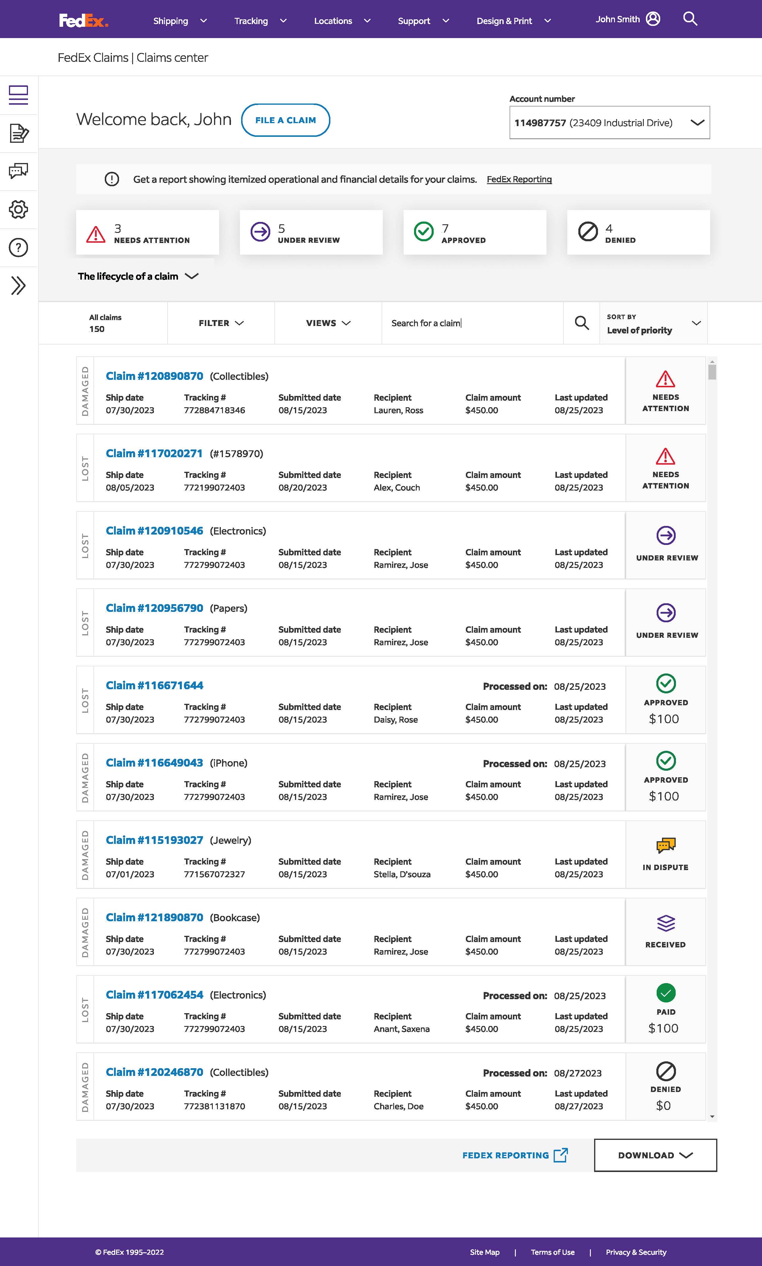
What Happened
Development said they could only change the UI. No backend changes. No new API calls. No database changes. The business fought it all the way up the chain. Leadership was told it won’t fix the actual problem. Leadership refused.
After go-live, the original team left. New people had no idea there had been a better plan. The original plan never happened.
The backend is where all the major pain points came from.
Claims needed to be addressed at a systemic level. No amount of design magic can fix that.
The teaching moment
Who was in the room is the whole lesson.
The room
Who was in the room.
Development wasn’t there when Claims was designed. On P&D Portal, they were. For three months. That is the difference.
The process
Design doesn’t work without process.
You can’t skip requirements, UX work, and co-design and ask for mockups. You can’t build something someone just made up.
The foundation
AI is not a shortcut.
If the backend can’t change, the design can’t either. AI doesn’t change that.
Contact
Let’s talk about what your program needs next.
Direct conversation, no pitch deck. Tell me what your program is wrestling with and where it’s behind. I’ll respond with how the method addresses it.